


Jordi Fornas, Catalan graphic designer
- The work of the painter and designer Jordi Fornas (Barcelona, 1927–2011), especially the design of the covers of books and records, was fundamental to the construction of the Catalan cultural identity of the 1960s. It was a fundamental element in a movement that sought the modernization of the Catalan culture of the season and the complete break with the Franco regime. “It was part of a historical moment and, from graphic design, it built a new identity – as Raimon said –, old and from a country,” explains graphic designer Pau Llop. Fornas exposed by the Institut d’Estudis Ilerdencs de Lleida. The Imatge of Catalunya dels 60 (Fornas. Llop has been curator of the exhibition The Image of Catalonia in 1960) and we have talked with him about the work of Fornas.


Llop, a fan of the albums produced in Catalonia in the 1960s, came to the work of Fornas through its covers, most of them edited by the label Edigsa. “The process of discovering his work was impressive, every door that opened to me was one more piece of a very broad graphic production, linked to a Catalan historical, political, social and cultural moment: The designs for the editorial Edicions 62, a reference in the dissemination of Catalan literature, the covers of the label Edigsa, the journal Serra d’Or i Presence and, finally, the Gran Enciclopèdia Catalana”.
Fornas participated in the main cultural projects of the time and in the campaigns to promote the use of Catalan in the 1970s. Thus, for some historians, the graphic work developed in these books, magazines and discs made Fornas become a graph of catality. The formula of the artist's Brand Identity was to combine pop in iconography with rationalism in typography.
For Llop, Fornas' most famous work is the collection of the black novel La Cua de Palla: “The collection, coordinated by Manuel de Pedrolo, is based on the tandem between editorial selection and spectacular design. Fornas used only two colors (black and yellow), a sans font and high contrast photographs (burnt). Thus, he defined the graphic and communicative style of an editorial collection that would go beyond the limits.”
Its style includes various influences, including Anglo-Saxon, French, Swiss and Catalan. Although Fornas was trained in Barcelona, he traveled to Paris and other European capitals to show his work. “In the covers made for the collection of the black novel La Cua de palla, for example, he used images from magazines here; that is, while history takes place in New York, design influences Switzerland and the reference is Catalan, the sum is universal,” says Llop.
Green on orange
The most significant work of the Catalan designer, his greatest work, is the Gran Enciclopèdia Catalana, dressed in green, ordered alphabetically in the shelves of the salons of several families. In 1968, he was commissioned to design and layout the encyclopedia. The encyclopedia was an ambitious cultural initiative that became a reference work on the cultural, social and economic situation of the time initiated by a generation of intellectuals. The Catalan designer showed the most demanding part of his graphic work. “It was the most technical and complex project he developed. It does not highlight the graphic aspect, but it does highlight the application of hierarchies and layout”, said Llop.
However, Fornas experienced multiple frictions with this work: the back of the book needed an orange, because the designer imagined it, but the publisher decided it was too eye-catching and painted it green. “They changed it so that it would not be highlighted so much in the halls of the Catalan houses.” To pay tribute to this imposed change, the organizers of the retrospective exhibition of Fornas have filled the exhibition and the catalog with orange.
More than a designer, painter
Fornas' graphic bravery was widely recognized in Catalan society, but not so much among the members of the guild, who were mostly considered painters. “Fornas has never been an important name in the world of Catalan design, partly because he was considered a painter. However, in the libraries and nightclubs of many Catalan houses, the presence of the design of Fornas is easily appreciated, the best tribute to a creator of pop culture”, emphasizes Llop.
Design was precisely a profession of Fornas. That is, it was a source of income to feed the family, with four children, because their true aspiration and vocation was painting. Thus, since 1975, when he received recognition in the design sector, he entered the home, and with this incursion his pictorial work increased considerably, while graphic work decreased.
“I think it’s important to distinguish between design and art. Both disciplines share spaces and resources, but each has a different application: design responds to a “commercial” need and art to the creative need of the artist. Fornas clearly distinguishes between one and the other, but it is clear that his preparation and artistic spirit influenced his design: freedom in typographic compositions, suggestive and modern color range…”, explains Llop. That is why Fornas would not see with good eyes the retrospective that has been seen in Lleida. At least that was communicated by the artist's family to the commissioner.
Fornas. The imatge of Catalunya dels 60, which closed its doors on 5 September, plans to move to other locations: “Valencia, Mallorca, Perpinyà, Montserrat… or Euskal Herria”. Many visitors have gone through the exhibition, including design students, collectors and art critics, “but especially the people who lived that historical moment.” As a collector of the LLOP itself, we asked him what work he would highlight in Fornas, to finish: “I would surely choose the album by Núria Feliu, which gathers the adaptation of the song Gent (People). It represents my relationship with the fornas and discs that he designed.”


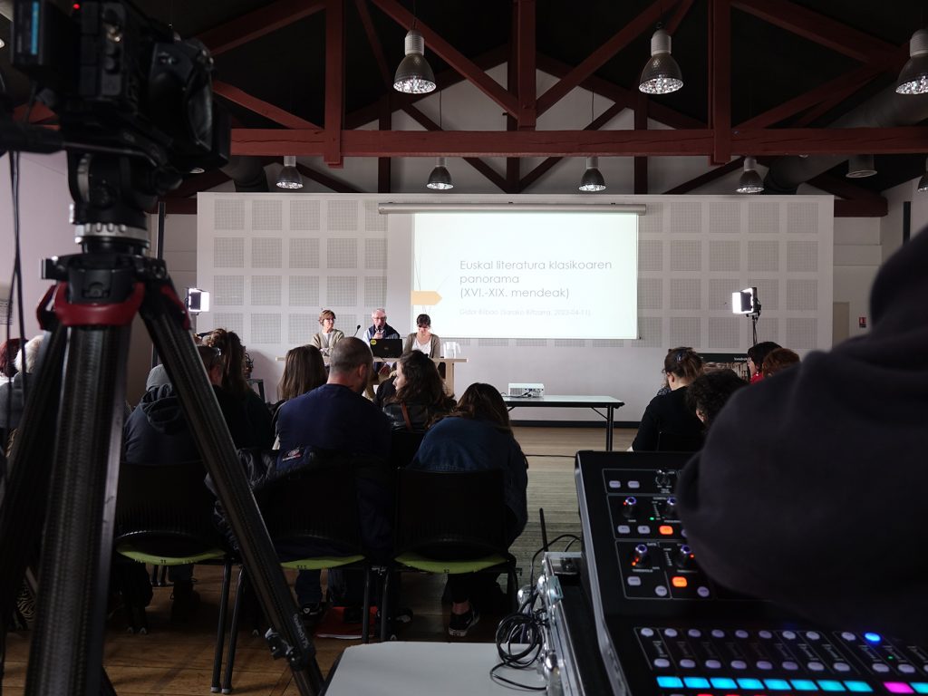
Transparent Beings
When: April 20th.
In which: In the Plaza of the Castle of Pamplona.
-----------------------------------------------
The concert is only half an hour away in the Plaza del Castillo de Pamplona; but it is still half empty, because it is raining. Whether... [+]

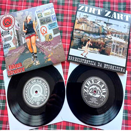
Obduction of Amenaza / Zirt Zart (Split-ep)
2024
---------------------------------------------------
The musical panorama is gigantic, impassable. Among them there are a few large groups that absorb all the foci; many others that are dedicated to the pursuit of it, and... [+]
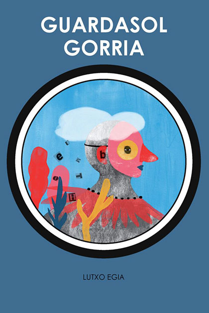
Guardasol gorria
Lutxo Egia
Susa, 2024
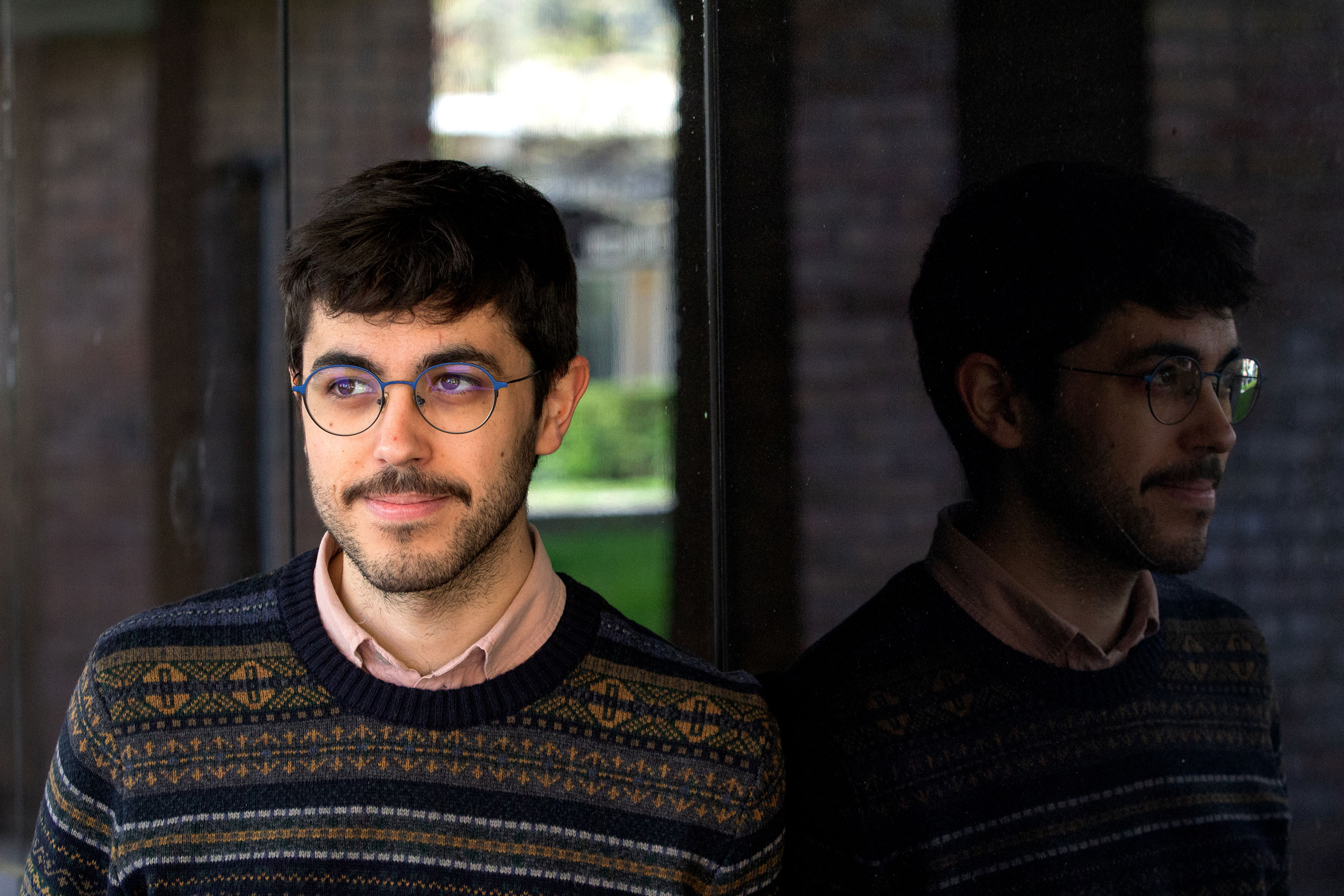
Iruñea ez da oso handia, baina Beñat Iturbek elkarrizketarako lekua hautatu duen arte ez dut jakin institutu berean ikasi genuela. Madril eta Iruñea artean bizi da, han hemen baino gehiago, oraingoz. Etxera egin duen bisita bat probestu dut harekin... [+]
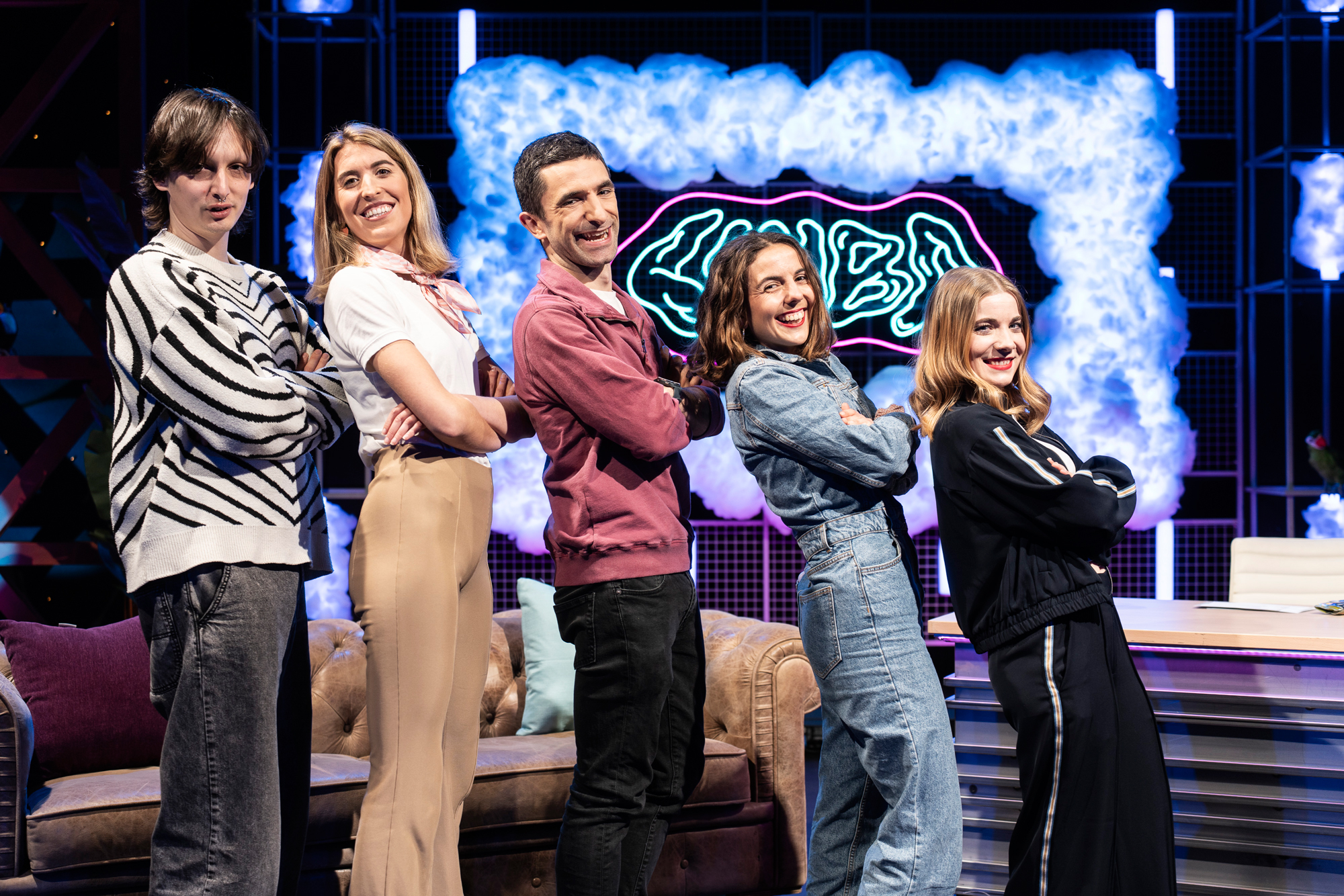
Apirilaren 24an, ETB1ean, jendeak aspalditik eskatzen zuen programa eredu bat estreinatuko da: Linbo, late night formatuko ordubete inguruko saioa, gazteek eta gazteentzat egina.

Hainbatetan esan izan didate arkitektoen lanaren gauzarik indartsuena dela ekoizten duguna betikotu egiten dela. Eraikinaren betikotasunak gizakiaren presentzia tenporala gainditzen duela eta geroko etorkizunean iraunkor egingo gaituela. Eta liburu batekin gertatzen ez den... [+]