


Society
Environment
Politics
Economy
Culture
Basque language
Feminism
Education
International
Opinion
saturday 26 april 2025
Automatically translated from Basque, translation may contain errors. More information here. 
A nod to modernity
- Almost revenge the moment when our letter molds jumped out of the inscriptions on the tombstones and began to become an alphabet. They've come a long way since then. We have loved them and idealized them, condemned them and considered them reactionary, rediscovered them and completed them. We still consider them as the exponents of our identity now.

Euskal tipografia
With a firm body and an irregular finish, Basque typography has nothing to see with aseptic and functional typefaces that are hollow sticks. It is notorious and arrogant, very visible, which does not go unnoticed. Being explained in the most classic forms, we recognize and identify it as soon as we see it, although we will not be able to define the characteristics in detail. Heavy, stuffing is often done, especially when it takes advantage of short word titles. Twisted and misunderstood, sometimes.
The characteristics that it contaminates according to its support are an indication of its great personality: it appears artisanal and traditional in wood and/or food labels; more elegant, in stone, in the doors of the houses; a little far from modernity, in an old and almost retrograde way, in the press, in the books.
It's exciting for us, too. Fully attached to the nature and geography here, let’s not imagine, let’s say, the Finnish name of a multinational frozen food company. Nor would we easily dream of it on the presentation pages or logo of a foreign holding company without resolving any Basque origin to its founders.
So this is our typography, which, to put it mildly, is of simple use. It’s everywhere in our corner, though. For example, in the signs of the roads, in the panels that welcome us in the villages, in the plates that explain the names in the streets, in the awnings of businesses and shops, in the front of the trucks, in the souvenirs of tourist areas, in the lanterns that are placed to clean the subs of the shoes, in the portals of the nominated houses, in the posters, in the ornaments... And, of course, in handicrafts, in elements linked to tradition or in products that want to give that appearance, in local foods. As well as in different aspects, associations and institutions linked to nationalism or dialeccalism, as well as in the administration. For example, in the logos of Seaska, PNV and the Basque Government.
Starting with the source, we have the Roman or Romanesque style as the starting point of our writing template. The Middle Ages, then.
The Roman invasion brought new symbols and shapes to work on the stone. Not the right tools to get those characters. Local craftsmen, who had not yet learned the techniques of metalworking, had to invent a special way of chiseling Latin letters, a system more suited to the power of their guides: instead of carving them deeply in the likeness of the Romans, they scratched the stone around the letter. That is, instead of bas-relief, they highlighted the image externally.
On the other hand, we are talking about an activity that was in the hands of very few families; a profession that is the fruit of a visual and domestic transmission; a tradition that is inherited. It is not surprising, therefore, that all the ancient facades of a given locality show the same characteristics, or that, as has happened in some cases, all the inscriptions of the same locality show the same spelling error.
These moulds, developed, maintained and separated in the valleys, have arrived today, at least in large part, thanks to the enormous work done by Abbot Louis Colas. Colas, beginning in 1888, took the pilgrim’s stick and explored the entire geography of the Basque Country from the side. He spent years collecting and classifying the inscriptions that he would find in churches, farms, cemeteries, leaving many examples that are lost or missing today catalogued.
More than a complete work, we have the encyclopedia of Basque typography that this passionate defender of Basque aesthetics joined and published with his money. With his pockets empty and desperate for the little attention shown by the public, he seems to have spent his last days completely apart from the world.
Even now, the typographer who wants to drink from old sources, the designer who wants to create a more modern version and/or the expert who wants to get to the bottom of the subject inevitably turns to this unique work left by Gráfica, ornamentación y simbología vascas a través de mil antiguas estelas discoideas Colas.
The period known as the Basque Renaissance marked the beginning of the Basque typography and the consolidation of its use by the generation of the great graphic artist Poco Zabalo. At the beginning of the last century, especially in that atmosphere that prevailed in the 20s and 30s, everything needed its color and flag, all of them brand and distinctive.
Even the Basque language was transformed into the symbol of a double purity by Sabine Purism. The language had to be free of stains, both with God and with the Fatherland. And everything associated with it differed from the way it was, starting with the alphabet and the letter molds.
In addition to the examples of Basque typography on posters, book covers – such as Txomin Agirre’s Garoa – Txikito Zabalo, a well-known illustrator of works such as Martín Txilibitu and Xabiertxo, left us with an excellent work curated with his brother Pablo Grafía y ornamentación popular vasca.
“Both Zabalo brothers had the same concern,” explains Joxean Muñoz Otaegui, on the website about Txiki, “they looked at the same thing, in letters Txiki and in ornaments Pablo: a possible tradition that would be useful to them.” “This book, published in 1947,” he continues, “has the air of a testament. The work is done in exile: Little was in England; in Venezuela, Pablo. They sent each other jobs by boat. Drawing in England, writing and completing in Venezuela, publishing in Argentina, secretly bringing to the Basque Country, this beautiful collection of Basque symbols is a symbol of the time when each book was a heroic adventure. Thanks to the courage of the Zabalo brothers, we received a systematized document, a complete muestrario, which would offer an important tool in the recovery of the ‘aesthetics of uniqueness’ that would be developed in the 70’s. This is how he made the process of converting local variations of medieval typographies into national writing.”
After the massifications of the 70’s and 80’s almost brought it to an end, it arrived in the 21st century freed from ideological burdens and with its ties to the Basque language cut short. Especially important in this sense is Thierry Arsaut’s effort to bring Basque typography to the digital model and to everyone’s computers.
This typographer, accompanied by the painter Ramuntxo Partarrieu, put on sale in 2001 a large family that had been researched and designed for several years. A collection of fourteen fonts, presented under the title Euskara.
From the bold letters that prevailed in the South Basque Country to the refined and stylized form that has been more specific to Lapurdi, Arsautena is the most plausible billet that has ever been known, although it still has an unsurpassed diskette format.
In addition to studying both significant sources and stelae and/or boxes over and over again, he had to take great ungrateful work to launch this collection in software. “The most difficult task has been to provide the most identifiable and also ancient features of these types of letters in computer technology,” he said. The perfect symmetry of the letter, which is almost impossible to do by hand, is achieved by simply pressing a key on the computers, but this gives the character a cold touch. Overcoming this same coldness and/or shaping its own variable thickness has been my biggest headache. Using cutting-edge technology, the goal has always been to shape the engravings of yesteryear.” A
long history of centuries but especially complete versions of the most used molds of the last fifty years are found in the Euskara collection, equipped with historical explanations and recommendations for its use. For example, the so-called Classic, the most widespread typography mold in the entire geography. For example, the so-called Modern, a unique variant that includes all the capital and small letters, all the accents being, designed in such a way that they can be used in other languages. Or the Ferrus, created in 1930, after receiving the ban of the Franco dictatorship, which was hidden in the North Basque Country by some Basques and Republicans, a single letter designed for use in the printing press.
The most anecdotal data of this Basque typography family is offered by the international auction held in Bilbao in March 2001. At the initiative of the German-born artist Hinrich Sachs and through the firm Consonni, the software and the computer exploitation rights of these fourteen types of fonts were put up for sale, starting from a minimum price of 70,000 euros. The euphoria was reduced in just five minutes, as the auction was cancelled in the absence of the buyer.
In addition to the classics, more than one new typography inspired by these forms has been released in this last decade. Arguing the need to modernize the style, alluding to the need to fill in the gaps that classic molds have, as well as to create a standardized “real” typography, most designers have resorted to correcting the rigors and roundness and/or equalizing the differences in thickness. The most identifiable features are to some extent camouflage, after all.
Examples of this “recreation” are the alphabets called Bilbao, Kai, Basque New and New Euskadi.
The first, curated on the initiative of the Bilbao City Council, was designed by Alberto Corazón in 2000. Believing that it can help to show the characteristics of an identity of its own to the local trade, it is made available to everyone and free of charge on the Internet. He is generally accused of having a copy of a font called Albertus.
The second, called Kai, was created in 1997 by San Sebastián designers Santos Bregaña and Mikel Enparantza. This type of lyrics played an extraordinary role in the auction mentioned above, to the surprise of its creators, who initially presented it as the fifteenth typography that makes up the Euskara family. However, it did not arrive at the auction and the rights of use must be paid.
The Basque New was created for the logo of the Basque Government by Enrique Lucas on behalf of the agency Visual. And New Euskadi came to the streets with a 2006 campaign to promote tourism in Gipuzkoa, Bizkaia and Álava. It is created by the designer Ernesto Arnáez.
The regulation of road signs, the abuse seen in different places, fashion and the thirst for innovation of designers, has put Basque typography back on its way in the South Basque Country. Not in the Northern Basque Country, where along with the Basque aesthetic model for housework, it has had a natural case of reproduction and, without significant changes but accepting small touches, has followed a path as elegant as logical. Where, with some exceptions, without losing the characteristics that are identifiable to us in the first blow, it shows an updated appearance.
The characteristics that it contaminates according to its support are an indication of its great personality: it appears artisanal and traditional in wood and/or food labels; more elegant, in stone, in the doors of the houses; a little far from modernity, in an old and almost retrograde way, in the press, in the books.
It's exciting for us, too. Fully attached to the nature and geography here, let’s not imagine, let’s say, the Finnish name of a multinational frozen food company. Nor would we easily dream of it on the presentation pages or logo of a foreign holding company without resolving any Basque origin to its founders.
So this is our typography, which, to put it mildly, is of simple use. It’s everywhere in our corner, though. For example, in the signs of the roads, in the panels that welcome us in the villages, in the plates that explain the names in the streets, in the awnings of businesses and shops, in the front of the trucks, in the souvenirs of tourist areas, in the lanterns that are placed to clean the subs of the shoes, in the portals of the nominated houses, in the posters, in the ornaments... And, of course, in handicrafts, in elements linked to tradition or in products that want to give that appearance, in local foods. As well as in different aspects, associations and institutions linked to nationalism or dialeccalism, as well as in the administration. For example, in the logos of Seaska, PNV and the Basque Government.
A little bit of history
Starting with the source, we have the Roman or Romanesque style as the starting point of our writing template. The Middle Ages, then.
The Roman invasion brought new symbols and shapes to work on the stone. Not the right tools to get those characters. Local craftsmen, who had not yet learned the techniques of metalworking, had to invent a special way of chiseling Latin letters, a system more suited to the power of their guides: instead of carving them deeply in the likeness of the Romans, they scratched the stone around the letter. That is, instead of bas-relief, they highlighted the image externally.
On the other hand, we are talking about an activity that was in the hands of very few families; a profession that is the fruit of a visual and domestic transmission; a tradition that is inherited. It is not surprising, therefore, that all the ancient facades of a given locality show the same characteristics, or that, as has happened in some cases, all the inscriptions of the same locality show the same spelling error.
These moulds, developed, maintained and separated in the valleys, have arrived today, at least in large part, thanks to the enormous work done by Abbot Louis Colas. Colas, beginning in 1888, took the pilgrim’s stick and explored the entire geography of the Basque Country from the side. He spent years collecting and classifying the inscriptions that he would find in churches, farms, cemeteries, leaving many examples that are lost or missing today catalogued.
More than a complete work, we have the encyclopedia of Basque typography that this passionate defender of Basque aesthetics joined and published with his money. With his pockets empty and desperate for the little attention shown by the public, he seems to have spent his last days completely apart from the world.
Even now, the typographer who wants to drink from old sources, the designer who wants to create a more modern version and/or the expert who wants to get to the bottom of the subject inevitably turns to this unique work left by Gráfica, ornamentación y simbología vascas a través de mil antiguas estelas discoideas Colas.
When Basque typography saw the light
The period known as the Basque Renaissance marked the beginning of the Basque typography and the consolidation of its use by the generation of the great graphic artist Poco Zabalo. At the beginning of the last century, especially in that atmosphere that prevailed in the 20s and 30s, everything needed its color and flag, all of them brand and distinctive.
Even the Basque language was transformed into the symbol of a double purity by Sabine Purism. The language had to be free of stains, both with God and with the Fatherland. And everything associated with it differed from the way it was, starting with the alphabet and the letter molds.
In addition to the examples of Basque typography on posters, book covers – such as Txomin Agirre’s Garoa – Txikito Zabalo, a well-known illustrator of works such as Martín Txilibitu and Xabiertxo, left us with an excellent work curated with his brother Pablo Grafía y ornamentación popular vasca.
“Both Zabalo brothers had the same concern,” explains Joxean Muñoz Otaegui, on the website about Txiki, “they looked at the same thing, in letters Txiki and in ornaments Pablo: a possible tradition that would be useful to them.” “This book, published in 1947,” he continues, “has the air of a testament. The work is done in exile: Little was in England; in Venezuela, Pablo. They sent each other jobs by boat. Drawing in England, writing and completing in Venezuela, publishing in Argentina, secretly bringing to the Basque Country, this beautiful collection of Basque symbols is a symbol of the time when each book was a heroic adventure. Thanks to the courage of the Zabalo brothers, we received a systematized document, a complete muestrario, which would offer an important tool in the recovery of the ‘aesthetics of uniqueness’ that would be developed in the 70’s. This is how he made the process of converting local variations of medieval typographies into national writing.”
A step towards the digital age
After the massifications of the 70’s and 80’s almost brought it to an end, it arrived in the 21st century freed from ideological burdens and with its ties to the Basque language cut short. Especially important in this sense is Thierry Arsaut’s effort to bring Basque typography to the digital model and to everyone’s computers.
This typographer, accompanied by the painter Ramuntxo Partarrieu, put on sale in 2001 a large family that had been researched and designed for several years. A collection of fourteen fonts, presented under the title Euskara.
From the bold letters that prevailed in the South Basque Country to the refined and stylized form that has been more specific to Lapurdi, Arsautena is the most plausible billet that has ever been known, although it still has an unsurpassed diskette format.
In addition to studying both significant sources and stelae and/or boxes over and over again, he had to take great ungrateful work to launch this collection in software. “The most difficult task has been to provide the most identifiable and also ancient features of these types of letters in computer technology,” he said. The perfect symmetry of the letter, which is almost impossible to do by hand, is achieved by simply pressing a key on the computers, but this gives the character a cold touch. Overcoming this same coldness and/or shaping its own variable thickness has been my biggest headache. Using cutting-edge technology, the goal has always been to shape the engravings of yesteryear.” A
long history of centuries but especially complete versions of the most used molds of the last fifty years are found in the Euskara collection, equipped with historical explanations and recommendations for its use. For example, the so-called Classic, the most widespread typography mold in the entire geography. For example, the so-called Modern, a unique variant that includes all the capital and small letters, all the accents being, designed in such a way that they can be used in other languages. Or the Ferrus, created in 1930, after receiving the ban of the Franco dictatorship, which was hidden in the North Basque Country by some Basques and Republicans, a single letter designed for use in the printing press.
The most anecdotal data of this Basque typography family is offered by the international auction held in Bilbao in March 2001. At the initiative of the German-born artist Hinrich Sachs and through the firm Consonni, the software and the computer exploitation rights of these fourteen types of fonts were put up for sale, starting from a minimum price of 70,000 euros. The euphoria was reduced in just five minutes, as the auction was cancelled in the absence of the buyer.
Contribution of creators and designers
In addition to the classics, more than one new typography inspired by these forms has been released in this last decade. Arguing the need to modernize the style, alluding to the need to fill in the gaps that classic molds have, as well as to create a standardized “real” typography, most designers have resorted to correcting the rigors and roundness and/or equalizing the differences in thickness. The most identifiable features are to some extent camouflage, after all.
Examples of this “recreation” are the alphabets called Bilbao, Kai, Basque New and New Euskadi.
The first, curated on the initiative of the Bilbao City Council, was designed by Alberto Corazón in 2000. Believing that it can help to show the characteristics of an identity of its own to the local trade, it is made available to everyone and free of charge on the Internet. He is generally accused of having a copy of a font called Albertus.
The second, called Kai, was created in 1997 by San Sebastián designers Santos Bregaña and Mikel Enparantza. This type of lyrics played an extraordinary role in the auction mentioned above, to the surprise of its creators, who initially presented it as the fifteenth typography that makes up the Euskara family. However, it did not arrive at the auction and the rights of use must be paid.
The Basque New was created for the logo of the Basque Government by Enrique Lucas on behalf of the agency Visual. And New Euskadi came to the streets with a 2006 campaign to promote tourism in Gipuzkoa, Bizkaia and Álava. It is created by the designer Ernesto Arnáez.
The regulation of road signs, the abuse seen in different places, fashion and the thirst for innovation of designers, has put Basque typography back on its way in the South Basque Country. Not in the Northern Basque Country, where along with the Basque aesthetic model for housework, it has had a natural case of reproduction and, without significant changes but accepting small touches, has followed a path as elegant as logical. Where, with some exceptions, without losing the characteristics that are identifiable to us in the first blow, it shows an updated appearance.


Most read
Using Matomo
#1
Urko Apaolaza
#2
Onintza Irureta Azkune
#4
Eneko Imaz Galparsoro
#5
Gorka Intxausti Aranguren

Newest

2025-04-25
Onintza Irureta Azkune
Identified the Basques in Osakidetza: a step on the way to guarantee arta in Basque?
Hospitalized patients will wear the “e” symbol on their wrist. The health workers know that these people have asked to be cared for. Osakidetza says it is another tool to facilitate communication in Basque. It’s one more step in a larger project. The main objectives of... [+]
"As a result of the HAPO approved by the City Council, Kabia is in an unstable situation"
Activities to commemorate the 19th anniversary of the occupied area of Kabia will be held from today to Sunday, from 24 to 26 April. This self-managed space, which is about to turn two decades old, has suffered several setbacks in its trajectory, and although it is threatened by... [+]

2025-04-25
Euskalerria irratia
Anesthesia, among the new predictions of Delirium Tremens, Zea Mays, Talco, Zetas and Naxker Hatortxu Rock
24 new bands have been announced by the Hatortxu Rock solidarity festival. 63 teams have already been announced and in total there will be 100 teams in the five stages of the festival.
2025-04-25
Gorka Intxausti Aranguren
The Transparent Beings
When the song rained
Transparent Beings
When: April 20th.
In which: In the Plaza of the Castle of Pamplona.
-----------------------------------------------
The concert is only half an hour away in the Plaza del Castillo de Pamplona; but it is still half empty, because it is raining. Whether... [+]

2025-04-25
Eneko Imaz Galparsoro
Trump asks Putin to stop, and Russia says it’s almost ready for peace deal
After accusing Zelenski of “endangering” the peace deal that should end the war in Ukraine, Trump has reprimanded Putin on his social network Social Truth. Foreign Minister Sergei Lavrov said that Russia is ready to conclude a peace agreement. Kiev reports that the body of a... [+]
2025-04-25
Olaia L. Garaialde
Citizens of the Uribe Coast claim the need for a public day center
It is the only region in Bizkaia that does not have a public day centre. The meeting will take place on April 27 at 12:00 in the Town Hall Square in Sopelana (Bizkaia).
2025-04-25
Jenofa Berhokoirigoin
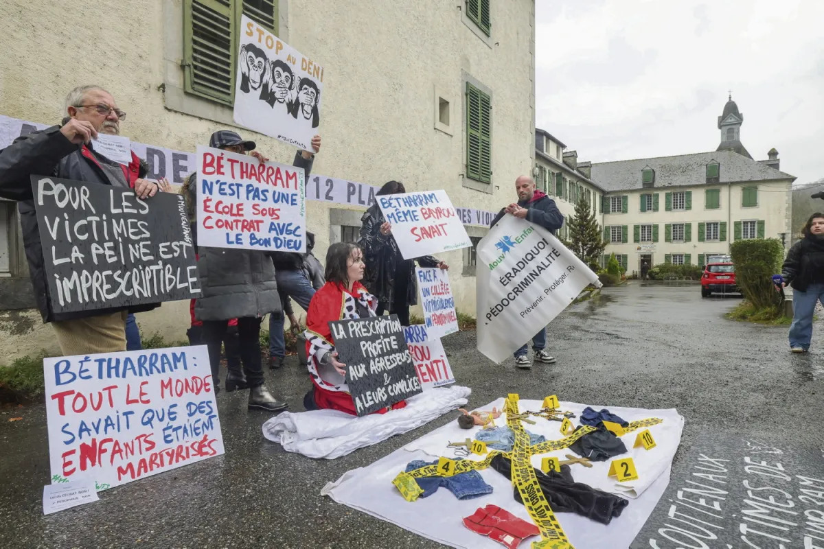
The daughter of the French prime minister also denounces that she was "brutally beaten" at the Betharram school
Helene Perlante, daughter of François Bayrou, testifies in the book Le silence de Bétharram (The Silence of Betharram), written by Alain Esquer. In the Catholic school that existed in the 1980s, students and for forty long years have been silently held back by the violence... [+]
2025-04-25
Urko Apaolaza Avila
The analysis
We're all on the chain
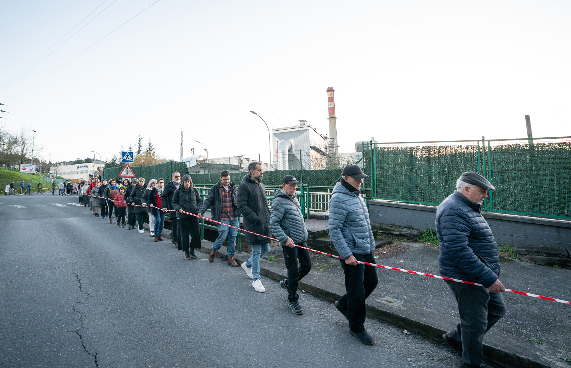
On January 29, something that we are not accustomed to in today’s selfish world happened at the gates of the Guardian factory in Laudio. The management showed its intention to shut down the oven there, and to counter this, the workers blocked the door by means of banners. But... [+]

2025-04-24
Xabier Letona Biteri
The Spanish government withdraws its purchase of Israeli bullets
The President of the Spanish Government, Pedro Sánchez, has ordered the cancellation of the bullet purchase made by the Spanish Ministry of the Interior with the Israeli company IMI Systems. The decision eases the risk of rupture in the government coalition between the PSOE and... [+]
2025-04-24
Jenofa Berhokoirigoin
This year’s Popular Step will be held under the motto ‘Elgar’ on May 11th
2025-04-24
Unai Lomana Uribezubia
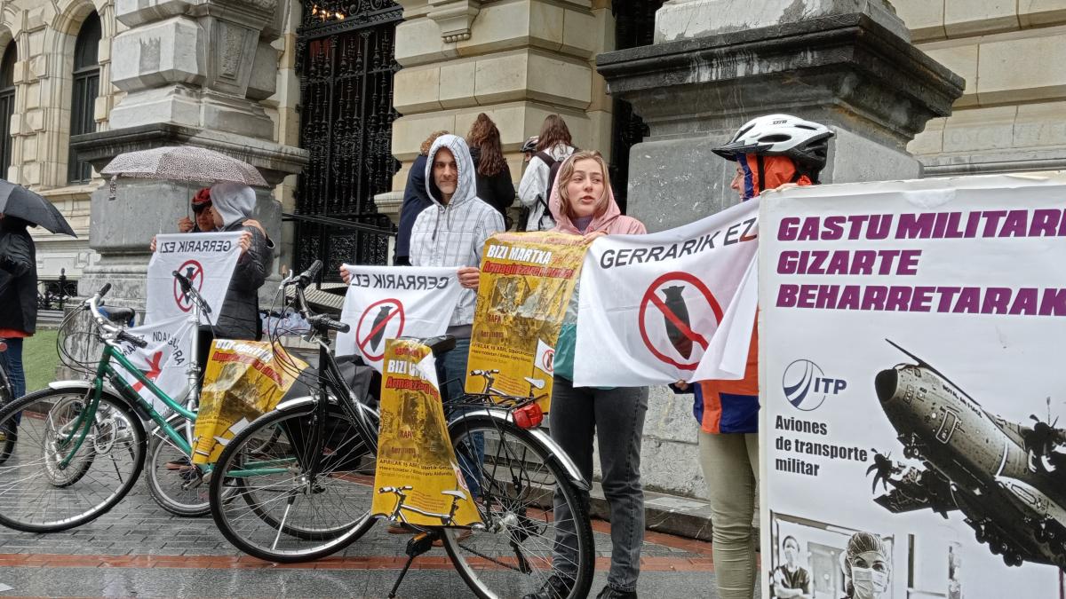
A bicycle march in Bilbao to denounce the increase in military budgets
The bicycle march will start from Bilbao and pass in front of the companies ITP Aero in Barakaldo and Sener in Getxo, because these two companies "are in charge of military production", according to the organizers. It will be a protest to denounce the increase in arms spending... [+]

A Busy Day of Pastors, in Ordizia
This year around 1,500 sheep have crossed the Gran Vía, divided into five herds. The official presentation of the new season of Idiazabal Cheese has been held at the City Hall. The cheese has been cut by Julen Baze and Peli Pérez de Anuzita from Restaurante Garena.

BY MADDI OIENART
“I started learning Basque by singing”
In 1997 he released his first album, Tierra Plata, with Mixel Arotze and Mixel Etxekoparr. He shares landscapes, silences and sounds that he has had in the background since he was very little. When he sings he feels that he is the transmitter of the previous voices and for this... [+]
Eguneraketa berriak daude