The development of plague in Italy, Spain and the Basque Country: a comparative effort
- How hard are we suffering the attack of Covid-19 in Euskal Herria? What speed does it take in our country, has caused many or few victims compared to others? In an attempt to bring the incomplete answer to reality, we have compared the graphs made by the victims of scams in Italy, the Spanish State and the Basque Country.

Pretext. I'm not a sociologist, much less an epidemiologist, and the data I use are found in the press, in the difficult working conditions of this general lockdown. With the help I have found and which I am grateful for in this precariousness, I have tried to answer the questions I mentioned above, especially to accuse me. This is what the data tell us, albeit little.
The graph made until the evening of 23 March shows that in Italy (10 deaths per 100,000 people) in the last two days the increase in deaths has slowed slightly, the intensity of the evolution has relaxed a little. In the Spanish State and in the Basque Country there is a very similar evolution (4.7 deaths per 100,000) and both continue to approach the percentages of Italy, with the same force or more than in previous days.
If the difference between the two curves was seven days a few days ago, then it went to six and on Monday, for the first time, it has approached five days. Therefore, the comparison suggests that, if we follow the trend of the last days, today, 24, the deceased in the twilight could be around 2,590 in Spain and 175 in Euskal Herria. (Remember that we refer to deaths accumulated from the beginning, not those of a day). And if evolution continues at the same rate, in Euskal Herria on 29 we would get the proportion given by Italy on day 24.
Let's go to the second graph.

The second graph shows the number of deaths per day. In this section, two main ideas: on the one hand, Italy had the highest number of deaths on 21 March and in the last two days it has fallen. In the coming days it will be seen whether it continues to go down or not, whether it is the most famous peak or the deadliest peak on March 21. On the other hand, in Spain and in Euskal Herria, daily deaths continue to increase. For the first time since the beginning of the crisis, all three have had a mortality rate similar to Monday, 23.
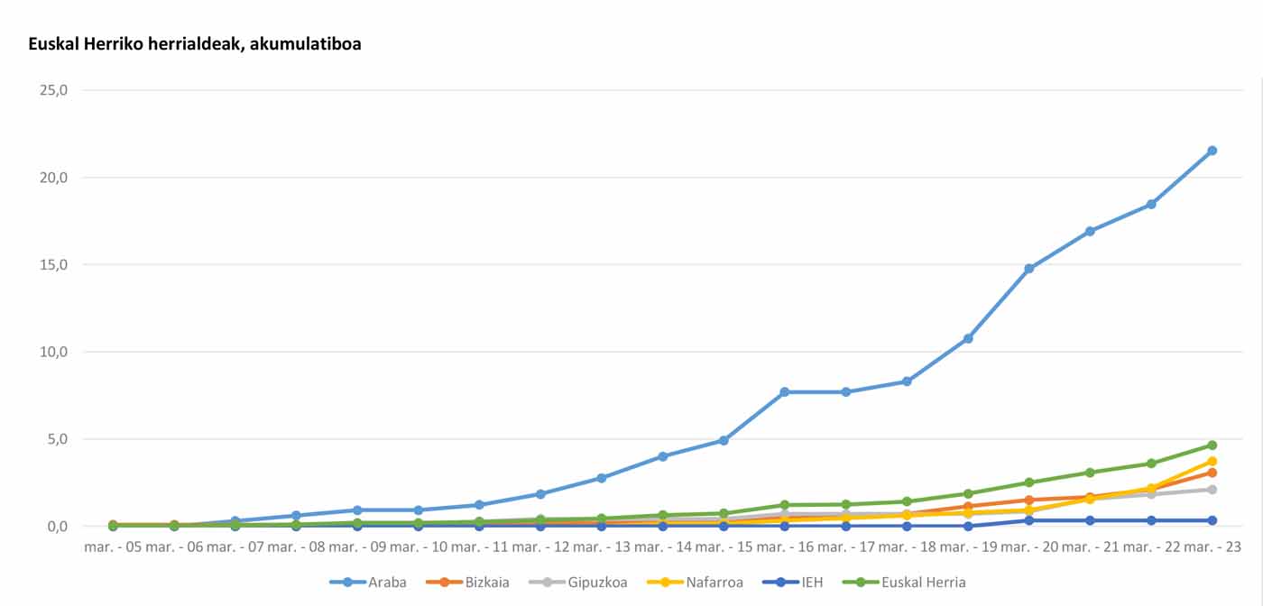
The third graph compiles the deaths so far in Euskal Herria, located by territory, the total deaths, which have accumulated since the beginning of the crisis. In Euskal Herria, 4.7 deaths per 100,000 inhabitants have accumulated until 23 March, according to the Basque Government. The data in Álava is very high and the one that has risen the most on the last day has also been positive. From one day to the next, it has gone from 18.5 deaths per 100,000 inhabitants to 21.5, which has made its curve still more pronounced. But since all comparisons are dangerous, if in a new attempt to find more clues we compare Álava with the Lombardy, which is the one suffering the most from the plague in Italy, with 3,776 deaths so far, it gives us a rate of 37.7 per 100,000 inhabitants, almost twice that of Álava.
Reading the graph, we note that on 21 March Bizkaia, Gipuzkoa and Navarra were at the same point of comparison and two days later, on 23 March, Navarre has advanced among the three; Bizkaia has also risen, although not so much as Navarre and Gipuzkoa has managed to maintain it. Unfortunately, Álava is increasing its distance from the rest of the territories of the Basque Country to the worse.
We must be very careful with the data of Ipar Euskal Herria. At the level of Euskal Herria, so far the Berria newspaper has followed them more fully – with all the obstacles recognized by the media – and in the last four days that figure of the only death is maintained.
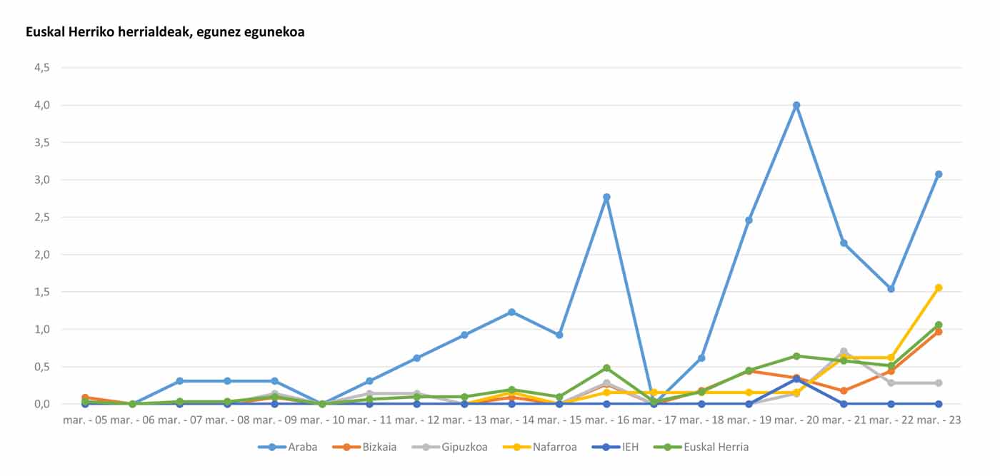
Graph 4 shows the daily development of the pest in each territory, with numbers of deaths on the curve. The mortality rate in Álava is the most worrying, as although the deaths of 20 and 21 March decreased, 23 grew again, more than in other territories. On the other hand, Bizkaia and, above all, Navarre have suffered significant increases. Gipuzkoa seems to be not going to climb much for the time being. As far as Iparralde is concerned, we should repeat the above remark here.


