

How the plague is going in Italy, Spain and Euskal Herria: comparison of March 26
- How hard are we suffering the attack of Covid-19 in Euskal Herria? What speed does it take compared to others? Given that the numbers of infected people are still not reliable enough – everyone recognises that, because of the excessive tests, we only know a part of the real cases – we in ARGIA have for the second time compared the most plausible data of people who died until 23 March, and in this second attempt, on Thursday 26 March, we look at those who have officially taken their seats in the sunset.

Before entering the substance, return to the declaration. I am not a sociologist, much less an epidemiologist, and the data I use are those found in the press, collected from public administrations. In this precarious confinement I have worked with the help I have found and which I am grateful for.
Let's go with the first graph. If the curves of evolution of the deceased until 23 March in Italy, the Spanish State and the Basque Country were very similar, on 26 March the three countries show different trends. While in Italy the number of deaths continues to rise, the pace has stabilized and now accumulates 13.5 deaths per 100,000 inhabitants. On the contrary, the Spanish curve has accelerated its rise in recent days and is approaching the figures of Italy (8.8 deaths per 100,000 inhabitants). If Spain had a delay of five days before compared to Italy, three days later that delay has been reduced to four days. As far as Euskal Herria is concerned, although the rise slowed on 24 and 25 March, on 26 March, a similar rise was recorded as in Spain. However, on 26 March Euskal Herria is now below the mortality rate in Spain (7.3 deaths per 100,000 inhabitants) and seems to maintain the 5-day decline with Italy.
If the evolution of the plague maintained the previous trend, Spain could accumulate in the night of March 27 267 deaths of Euskal Herria. (Accumulated ever since the Covid-19 plague began to spread).

The second graph shows the number of deaths per day (deaths per 100,000 inhabitants). If, on 23 March, three days ago, it could be said that Italy, Spain and Euskal Herria had been found for the first time in their figures at the same point, that is, with a mortality rate similar to that of the day, since then trends have changed or mixed. On 24 March Italy and Spain increased, but on 25 and 26 March Spain continued to rise and Italy maintained the rate more or less the same, so the economy remained stable. In the case of Italy, it is possible that it is in its bulk or, since in the last 7 days its mortality ranges from 1.0 to 1.3, so it does not rise any more.
In contrast, in the case of the Spanish curve, it continues to rise and Italy surpassed the point never reached with a death rate of 1.4 on 25 March and on 26 March it rose to 1.5. As regards the rate in the Basque Country, on 26 March, despite the slight fall of 24 and 25 March, Italy has once again increased its rate in one day.
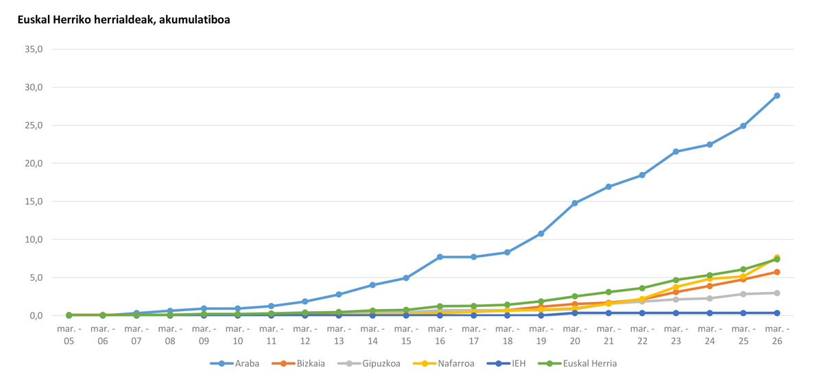
The third graph shows the mortality rate of 7.4 per 100,000 inhabitants accumulated by the Basque Country as a whole until March 26. Álava not only continues to suffer the highest mortality rate: in order to aggravate it, in the last three days Álava has been the territory where mortality has increased the most, going from 21.5 deaths per 100,000 inhabitants to 28.9, which represents an increase of 7.4 points between 23 and 26 March. The media should emphasise more strongly the gravity of the situation in Álava and take account of all the citizens in our solidarity with the Alaveses and Alaveses, as in our actions.
Navarre is the second country with the highest mortality rate, providing the Basque Country average: the mortality rate has also experienced a large increase in Navarre. Bizkaia continues its gradual rise, always at the same rate (5.7 rate) and has a rate 5 times lower than that of Álava. Gipuzkoa, for its part, continues to maintain its relatively low rate vis-à-vis other territories.

Graph 4 shows the daily development of the pest in each territory, with numbers of deaths on the curve. As shown in the graph above, the mortality rate in Álava is the most worrisome. Despite the fall of 24 March, 25 March grew significantly and 26 did so even more, reaching 4 deaths per 100,000 inhabitants in one day. There are changes in the rest of the countries, but until 26 March it has been possible to keep the mortality rate below 1.0... until the disturbing data of 26 March have been revealed: on Thursday Navarre has suffered a very high mortality rate, which has reached a rate of 2 per 100,000 inhabitants. The evolution of Navarre will have to be followed closely.
As we said at the beginning, this is merely an attempt to gain a better understanding of the actual situation of the crisis at this time. The analysis of those infected with COVID-19 at every moment would probably provide us with clearer information about the speed of spread of COVID-19, as it is clear that it is first spread to people and a few days later or is still healthy or dead. But knowing that the information of the infections we have so far is very small, that they can be 10 times more contagious than the officially recognized... at the moment it could be thought that the death data give us the brightest clues, making it clear that every day of contagion they give us the picture late.